Turn Off the Lights With angular-dark-mode

Recently, I launched my minimal portfolio (the one you are in right now!)
Using React and Gatsby, I have a ton of options to choose from, but I stumbled upon a minimal yet powerful library called use-dark-mode. Ten minutes later, I already had dark mode integrated into my portfolio!
As an Angular developer, I thought it would be nice to have such a library in our ecosystem as well, so I created angular-dark-mode!
Final code and demo available in this stackblitz.
Setup
First, let's quickly create an angular project we can play with by running:
npx @angular/cli new dark-mode-playground --minimal
Next, add angular-dark-mode:
npm i angular-dark-mode
Or if you prefer yarn:
yarn add angular-dark-mode
Lastly, add the angular-dark-mode.js file to the angular.json scripts section:
{
  "scripts": ["./node_modules/angular-dark-mode/angular-dark-mode.js"]
}
For more on angular-dark-mode.js, see below.
Show Me the Code
angular-dark-mode ships with some configurable options:
| Option | Description | Default Value |
|---|---|---|
| darkModeClass | dark mode css class name | 'dark-mode' |
| lightModeClass | light mode css class name | 'light-mode' |
| preloadingClass | css class name to flag that element is in preloading state | 'dark-mode-preloading' |
| storageKey | localStorage key to persist dark mode | 'dark-mode' |
| element | target HTMLElement to set given css classes | document.body |
Given the default options, let's add some styling to reflect our dark and light modes:
body {
  margin: 0;
}

body:not(.dark-mode-preloading) {
  transition: all 0.3s linear;
}

body.dark-mode {
  background-color: #2f3542;
  color: #f1f2f6;
}

body.light-mode {
  background-color: #f1f2f6;
  color: #2f3542;
}
We want to set styles based on the default configuration above, so we set the styles of dark-mode and light-mode CSS classes.
Also, we want a nice transition between the modes but want to skip the initial transition, so we set it after the preloading phase.
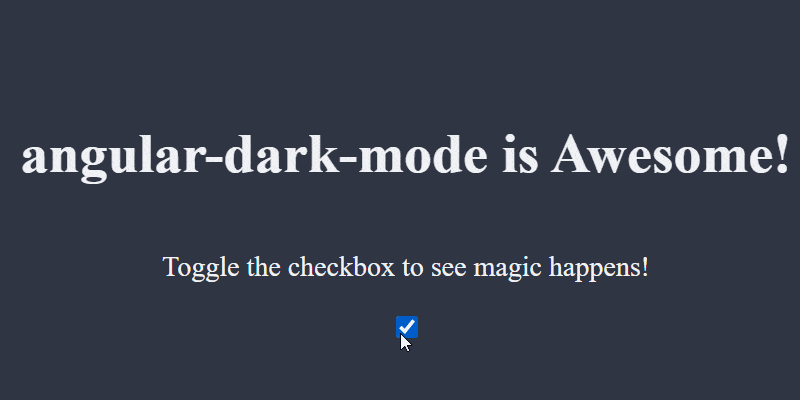
Moving on to app.component.ts, inject DarkModeService and add some text as well as a toggle button:
import { Component } from '@angular/core';
import { DarkModeService } from 'angular-dark-mode';
import { Observable } from 'rxjs';

@Component({
  selector: 'app-root',
  template: `
    <h1>angular-dark-mode is Awesome!</h1>
    <p>Toggle the checkbox to see magic happens!</p>
    <div>
      <input
        type="checkbox"
        [checked]="darkMode$ | async"
        (change)="onToggle()"
      />
    </div>
  `,
  styles: [
    `
      :host {
        min-height: 100vh;
        display: flex;
        flex-direction: column;
        justify-content: center;
        align-items: center;
      }
    `,
  ],
})
export class AppComponent {
  darkMode$: Observable<boolean> = this.darkModeService.darkMode$;

  constructor(private darkModeService: DarkModeService) {}

  onToggle(): void {
    this.darkModeService.toggle();
  }
}
All set! Run the application, and depending on your OS theme, it will open in dark or light mode:
angular-dark-mode.js
This file has a few purposes:
-
Persistence — angular-dark-mode saves your preference in
localStorage. When the app loads, it retrieves the latest value fromlocalStorageor falls back to the OS’s preference. -
Preloading — As we saw, the preloadingClass option can be quite handy when we want to skip the initial transition, so we set the
preloadingClassin this file and remove it after initialization.
The angular-dark-mode.js file shipped with the library assumes you are using default options. If you override them, be sure to copy angular-dark-mode.js locally, make the necessary changes, and load the local file in angular.json instead of the library one.